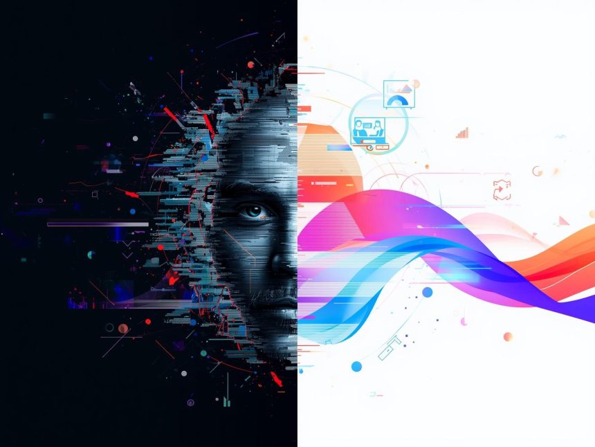
In the fast-moving world of digital marketing, how visuals appear is just as important as what they show. With more people browsing on mobiles, tablets, and desktops, it’s no longer enough to use static images. Enter adaptive visuals—smart visual content that automatically adjusts to different screens, user preferences, and environments.
This article explores what adaptive visuals are, why they matter in today’s marketing, how they improve customer engagement, and how businesses can start using them effectively.
What Are Adaptive Visuals?
Adaptive visuals refer to images, graphics, or videos that automatically adjust depending on the viewer’s device, screen resolution, internet speed, or even geographic location. They ensure that content always looks its best, no matter where or how it’s viewed.
Examples of adaptive visuals include:
- A banner image that displays in high-resolution on a desktop but loads a lighter version on mobile.
- Ads that change layout between horizontal (for desktop) and vertical (for smartphone).
- Visuals that differ based on user location or language preference.
This dynamic approach provides a smoother, more engaging experience—and boosts marketing results.
Why Adaptive Visuals Are Crucial in Digital Marketing
1. Enhances Mobile Experience
Mobile users now make up over 60% of global internet traffic (Statista, 2024). However, mobile screens are smaller and networks may be slower. Adaptive visuals solve this by optimising images and layouts for mobile devices, reducing load time and improving readability.
According to Google, 53% of mobile users leave a website if it takes more than three seconds to load (Think with Google, 2018). Lightweight, adaptive visuals reduce this risk.
2. Boosts Engagement and Conversions
Visual appeal plays a key role in capturing attention. A recent Adobe report found that seven in ten users are more likely to engage with well-designed, visually attractive content (Adobe, 2022). Adaptive visuals make sure the design fits well across devices, encouraging users to stay longer and act—whether it’s clicking a button, filling out a form, or making a purchase.
3. Improves SEO Rankings
Adaptive visuals contribute to faster load times, mobile responsiveness, and better usability—all of which are Google ranking factors (Moz, 2023). This improves organic visibility and drives more traffic from search engines.
4. Supports Personalised Marketing
Adaptive visuals can also personalise the experience. For example, brands can show different visuals to:
- Shoppers in different countries
- First-time vs. returning visitors
- Users on slow vs. fast connections
This creates a more relevant and meaningful journey for each user, increasing trust and likelihood of conversion.
Real-World Examples of Adaptive Visuals
E-Commerce Stores
Platforms like Shopify and BigCommerce automatically adjust product visuals depending on the shopper’s device. Mobile users see compressed versions for fast loading, while desktop users get high-resolution images with zoom.
Social Media Ads
Social platforms like Facebook and Instagram use dynamic creative tools that resize and reformat ads to fit different placements—like feeds, stories, and reels. Meta Ads Manager simplifies this process by generating various versions from a single visual.
Responsive Websites
Design tools like Canva, Adobe Express, and Figma allow marketers to resize visuals for each digital platform. This ensures consistency across landing pages, social posts, email banners, and display ads.
How to Create Adaptive Visuals: Tools and Tactics
✅ 1. Use Responsive Formats
Start with image formats like SVG (for icons and logos) and WebP (for photos). These provide high-quality visuals with smaller file sizes, making them perfect for adaptive design.
✅ 2. Use Auto-Resizing Tools
Tools such as:
offer templates that auto-adapt to different screen sizes or social platforms.
✅ 3. Optimise File Size
Use image compression tools like:
These reduce image weight without sacrificing quality—important for fast-loading visuals on all devices.
✅ 4. Preview Across Devices
Before publishing, test how visuals look on multiple screens using tools like:
This helps avoid display issues that could turn users away.
Challenges and How to Overcome Them
❗Increased Design Workload
Creating multiple versions of each visual can be time-consuming. Solution: Use AI-powered tools like Canva AI to automate resizing and layout design.
❗Platform Incompatibility
Some CMSs may not support adaptive visual logic natively. In such cases, adding responsive image code (srcset and sizes in HTML) or using plugins can help.
❗Slow Visual Testing
Manually checking visuals can be slow. Use batch testing tools or responsive design frameworks like Bootstrap or Tailwind CSS for faster scaling.
Future Trends: Smarter, AI-Powered Visuals
The future of adaptive visuals is intelligent and automated. Here’s what’s next:
- AI-Generated Visuals: Tools like Runway and Designify use AI to auto-create visuals based on product, brand, or audience data.
- Real-Time Personalisation: Based on user data, visuals will soon change on the fly—optimised for time of day, emotional cues, or user interest.
- AR/VR Integration: Adaptive visuals in augmented and virtual reality will adjust to how users interact with environments, improving brand storytelling.
Best Practices Checklist for Adaptive Visuals
| Practice | Tool/Platform Example |
| Use vector (SVG) and WebP formats | Adobe Illustrator, TinyPNG |
| Compress images before upload | Squoosh, TinyPNG |
| Test visuals across devices | BrowserStack, Responsively |
| Use auto-resizing templates | Canva, Adobe Express, VistaCreate |
| Lazy-load images | WordPress Lazy Load Plugin |
| Use CDNs for faster delivery | Cloudflare, Amazon CloudFront |
Note
In today’s digital environment, adaptive visuals are not just a trend—they are essential. They improve loading speed, user experience, personalisation, and even SEO ranking. Whether it’s an online shop, a social media campaign, or a corporate website, adaptive visuals can help marketers speak directly to each user in the most effective way.
By using the right tools, testing across devices, and focusing on the user’s journey, brands can build stronger connections—screen by screen, click by click.
More Read

References
Adobe. (2022). Future of Marketing: 2022 Digital Trends Report. Retrieved from https://business.adobe.com/resources/reports/2022-digital-trends.html
Moz. (2023). SEO Ranking Factors. Retrieved from https://moz.com/learn/seo/google-ranking-factors
Statista. (2024). Mobile internet traffic worldwide from 1st quarter 2015 to 4th quarter 2023. Retrieved from https://www.statista.com/statistics/277125/share-of-website-traffic-coming-from-mobile-devices/
Think with Google. (2018). Mobile site speed: The consumer impact. Retrieved from https://www.thinkwithgoogle.com/consumer-insights/consumer-trends/mobile-site-speed-statistics/
TinyPNG. (n.d.). Smart PNG and JPEG compression. Retrieved from https://tinypng.com/
Canva. (n.d.). AI-powered tools and adaptive design templates. Retrieved from https://www.canva.com/
Meta. (n.d.). Dynamic creative: Automatically adjust ads to each viewer. Retrieved from https://www.facebook.com/business/help/1707761466141599
BrowserStack. (n.d.). Cross-browser testing tool. Retrieved from https://www.browserstack.com/
Runway. (n.d.). Generative AI for creatives. Retrieved from https://runwayml.com/


