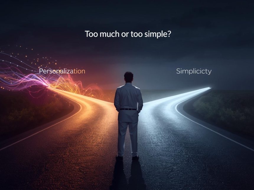
Today’s digital users expect products and services to feel both intuitive and relevant. That means offering personalisation—content, features, and recommendations tailored to individual preferences—without sacrificing the simplicity that makes products easy to use. But balancing these two can be a real challenge.
Too much personalisation can make interfaces feel cluttered and unpredictable. Too much simplicity can make experiences feel generic or limited. This article explores how to blend personalisation and simplicity in user experience (UX) design to meet user expectations without adding unnecessary complexity.
What Is Personalisation in UX?
Personalisation in UX is the process of tailoring a digital experience based on a user’s behaviour, preferences, history, or context (McKinsey & Company, 2021). It aims to improve relevance, engagement, and satisfaction by presenting the right information at the right time.
Examples:
- Spotify recommending songs based on listening habits
- Google Maps suggesting routes based on traffic and location
- Netflix showing “Because you watched…” titles
- Amazon showing frequently bought items based on past purchases
According to McKinsey & Company (2021), 71% of consumers expect personalisation, and 76% are frustrated when they don’t receive it.
What Is Simplicity in UX?
Simplicity in UX is about making interfaces clear, intuitive, and easy to use, especially for first-time or casual users. It reduces the cognitive load—the amount of mental effort required to complete a task—and increases efficiency.
Nielsen Norman Group (2023) explains that simplicity improves usability and decreases abandonment rates. Simple interfaces help users quickly find what they need, complete tasks, and trust the product.
The Tension Between Personalisation and Simplicity
While both personalisation and simplicity are beneficial, they can sometimes work against each other:
| Personalisation | Simplicity |
| Adds dynamic and adaptive content | Keeps design static and predictable |
| Surfaces more features and options | Limits choices to reduce clutter |
| Offers tailored experiences | Offers consistent experiences for everyone |
| Requires complex logic and data | Relies on straightforward workflows |
Too much personalisation can create clutter or unpredictability. Too much simplicity can limit flexibility and feel impersonal. A good UX strikes a balance between these two forces.
Risks of Over-Personalisation
1. Loss of Predictability
When layouts or elements shift based on behaviour, users may become disoriented. This breaks interface consistency, a key usability principle (Nielsen Norman Group, 2023).
2. Decision Fatigue
Offering too many recommendations or content options overwhelms users and increases drop-off rates.
3. Privacy Concerns
Personalisation relies on user data. When transparency is lacking, users may feel uncomfortable. In a Pew Research Center survey (2019), 79% of Americans reported concerns about how companies use their personal data.
4. Unfair or Narrow Experiences
Algorithms can reinforce existing habits, reducing diversity of content and excluding edge-case users (UX Collective, 2022).
Risks of Over-Simplicity
1. Lack of Depth for Power Users
Simplified designs may frustrate experienced users who want more control or advanced options.
2. Generic Experiences
Users may find little value if everyone gets the same interface and content, leading to lower engagement.
3. Missed Conversion Opportunities
Personalisation increases retention and conversion. Over-simplified products may fail to drive users toward their goals.
How to Find the Right Balance
1. Use Smart Defaults
Start users with a clean, simple default interface. Then gradually introduce personalisation based on actions and preferences.
✅ Example: Gmail starts with default filters but lets users add labels and rules as they go.
2. Apply Progressive Disclosure
Show only the most essential elements upfront. Let users discover advanced features only when needed.
✅ Tool: Figma supports design systems that reveal layers of complexity over time.
3. Offer Control and Transparency
Allow users to manage what’s being personalised and why. Show clear explanations like:
“Recommended based on your last purchase”
✅ Example: Netflix explains why a show is suggested and offers a simple thumbs up/down to refine the algorithm.
4. Segment Users Thoughtfully
Not every user needs personalisation. Segment by role, behaviour, or experience level:
- First-time visitors: Keep it simple and goal-focused
- Returning users: Show shortcuts or recently viewed items
- Power users: Unlock deeper configuration options
✅ Tool: Segment helps build user profiles for relevant targeting.
5. Design with Layout Consistency
Even if content is dynamic, maintain predictable layout patterns. Keep menus, buttons, and navigation in consistent places.
✅ Example: Amazon shows different product suggestions per user, but the layout remains consistent across visits.
6. Prioritise Clarity Over Complexity
Avoid showing every personalisation at once. Use space, hierarchy, and icons to guide attention. Ensure clarity comes first.
✅ Tool: Hotjar and UserTesting help test user responses to different UI strategies.
Real-World Case Studies
1. Duolingo: Simplicity with Personalisation
Duolingo offers a simple gamified UI for all users but adjusts:
- Lesson difficulty
- Vocabulary exposure
- Notification timing
…based on user progress.
This approach keeps the app fun and light while being deeply personalised behind the scenes (Duolingo, 2023).
2. Notion: Minimal by Default, Powerful by Choice
Notion starts with a minimal layout—great for beginners. As users engage, they unlock:
- Templates
- Workspace customization
- Team collaboration tools
This allows for growth without overwhelming new users.
3. Amazon: Structured Layout, Personalised Content
Amazon’s homepages are heavily personalised—past orders, wish lists, similar items. Yet the structure remains familiar, with a search bar, filters, and categories that guide users.
Tools That Help Maintain the Balance
| Tool | Use Case | Link |
| Optimizely | A/B test personalised vs. simple layouts | optimizely.com |
| Heap | Event tracking to identify friction | heap.io |
| Amplitude | Behavioural analytics | amplitude.com |
| UXPressia | Journey mapping | uxpressia.com |
Design Principles to Remember
| Principle | Why It Matters |
| Keep defaults simple | Reduce overwhelm for first-time users |
| Let users opt in/out | Build trust and user control |
| Be transparent | Explain recommendations and personal data use |
| Keep layouts consistent | Help users learn and navigate quickly |
| Reveal complexity gradually | Avoid scaring users with too many features upfront |
Note
Striking the right balance between personalisation and simplicity isn’t about choosing one or the other—it’s about orchestrating them in harmony. Simplicity creates clarity and ease; personalisation adds relevance and efficiency. Together, they form the foundation of a thoughtful, user-centric experience.
By segmenting users, offering control, maintaining layout consistency, and layering complexity over time, designers can create digital products that feel both personal and intuitive. When done well, this balance empowers users, builds trust, and strengthens engagement.
More Read

References
Duolingo. (2023). Company fact sheet. https://www.duolingo.com/
McKinsey & Company. (2021). Next in personalisation 2021 report. https://www.mckinsey.com/business-functions/growth-marketing-and-sales/our-insights/the-value-of-getting-personalization-right-or-wrong-is-multiplying
Nielsen Norman Group. (2023). Simplicity in UX: Why it matters. https://www.nngroup.com/articles/simplicity-ux/
Pew Research Center. (2019). Americans and privacy: Concern about data use. https://www.pewresearch.org/internet/2019/11/15/americans-and-privacy-concern-about-data-use/
UX Collective. (2022). When personalisation goes wrong: Overdesigning the UX. https://uxdesign.cc/


