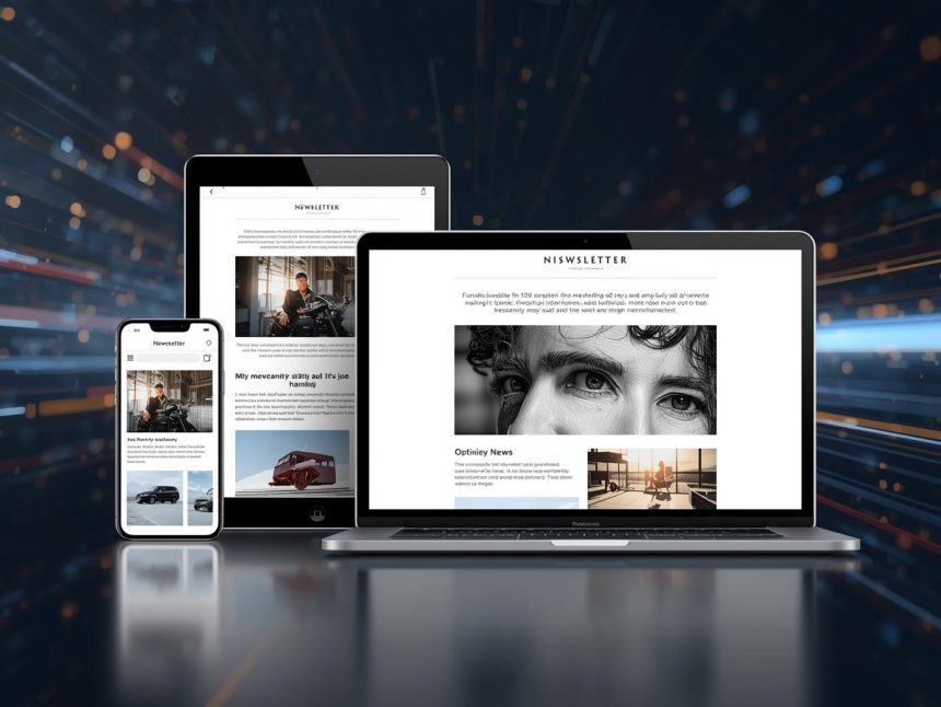
In an increasingly mobile-first world, the way we consume digital content has profoundly shifted. For email marketers, this means the small screen is often the first, and sometimes only, point of interaction with a subscriber’s message. Generic, non-responsive emails are quickly dismissed, leading to lost opportunities and frustrated users. This article will delve into the critical importance of mobile optimization and the latest email design trends, exploring how marketers can ensure their emails are not only responsive and display flawlessly across various screen sizes but also stand out, engage audiences, and are accessible to everyone.
The Mobile Imperative: Why Optimization is Non-Negotiable
The statistics are clear: mobile devices dominate email consumption. A significant percentage of emails are opened on mobile devices, making mobile optimization not just a best practice, but a fundamental requirement for effective email marketing (cmercury.com, n.d.). For instance, nearly 60% of millennials primarily use their mobile device to check email (Forbes, 2024, as cited in Sixth City Marketing, n.d.). This widespread mobile usage means that if your emails aren’t optimized for smaller screens, you’re alienating a large portion of your audience and sacrificing potential engagement and conversions.
Mobile optimization in email marketing refers to the practice of designing and coding emails so they render correctly and are easily readable and interactive on mobile phones and tablets. This goes beyond simply shrinking a desktop email; it involves a strategic approach to layout, content, and calls-to-action (CTAs) to ensure an optimal user experience on any device.
The consequences of failing to optimize for mobile are severe:
- High Bounce Rates: Users quickly abandon emails that are difficult to read or navigate on their mobile devices.
- Increased Unsubscribes: Frustrated subscribers are more likely to opt-out if your emails consistently provide a poor mobile experience.
- Damaged Brand Reputation: A clunky mobile email reflects poorly on your brand’s professionalism and attention to detail.
- Lost Conversions: If users can’t easily click on CTAs or view product images on mobile, they won’t convert. Companies see a 15% increase in clicks when sending mobile-friendly emails (G2, 2024, as cited in Sixth City Marketing, n.d.).
Core Principles of Mobile-First Design for Email
Mobile-first design is an approach where you design for the smallest screen (mobile) first, then progressively enhance the design for larger screens (tablets, desktops). This ensures that the core content and functionality are present and optimized for mobile, providing a solid foundation before adding more complex elements for larger displays.
Key principles for mobile-first email design include:
1. Responsive Design
This is the cornerstone of mobile optimization. Responsive email design uses flexible grids, images, and CSS media queries to automatically adjust the layout and content of an email to fit the screen size of the device it’s being viewed on. This ensures that text is legible, images scale correctly, and elements don’t overlap or break the layout.
2. Single-Column Layouts
For mobile, a single-column layout is generally preferred. This ensures easy readability and minimizes the need for horizontal scrolling, which is a major pain point for mobile users. Multi-column layouts often stack vertically on mobile, so designing with this in mind from the start is crucial (WPFunnels, 2025).
3. Clear and Concise Content
Mobile screens have limited real estate. Keep your email copy concise, scannable, and to the point. Use short paragraphs, bullet points, and clear headings. Get to the main message quickly, ideally within the first few sentences.
4. Large, Tappable CTAs
Buttons and links must be large enough to be easily tapped with a thumb, preventing accidental clicks. Aim for a minimum size of 44×44 pixels for interactive elements, and ensure sufficient padding around them (WPFunnels, 2025). Use clear, action-oriented text for your CTAs (Webliquids, n.d.).
5. Optimized Images
Images should be compressed to reduce file size, ensuring fast loading times on mobile networks. Use responsive image techniques so they scale appropriately without distorting the layout. Always include descriptive alt text for images, which improves accessibility and provides context if images fail to load (WPFunnels, 2025).
6. Short Subject Lines and Preheader Text
Mobile email clients often truncate long subject lines. Keep your subject lines concise and impactful, ideally under 50 characters, to ensure they are fully visible (Sender.net, 2025). Utilize preheader text effectively to provide additional context and entice opens, as this often appears prominently next to the subject line on mobile devices (Klaviyo, 2025).
Emerging Email Design Trends for Enhanced Engagement
Beyond fundamental mobile optimization, several design trends are shaping the future of email marketing, focusing on aesthetics, user experience, and accessibility:
1. Interactive Elements (AMP for Email)
As discussed in a previous article, interactive elements are a major trend. Accelerated Mobile Pages (AMP) for Email allows for dynamic and interactive content directly within supporting email clients (like Gmail), enabling features like accordions, carousels, quizzes, and forms without leaving the inbox. This transforms emails into highly engaging mini-webpages (cmercury.com, n.d.).
2. Dark Mode Optimization
With about 82% of people using “dark mode” on their phones (cmercury.com, n.d.), optimizing emails for dark mode is becoming essential. This involves using darker colors for text and graphics to ensure readability and visual appeal in dark mode environments, preventing issues like white logos disappearing on dark backgrounds or bright backgrounds creating a jarring experience.
3. Accessibility and Inclusivity
Designing for accessibility is no longer optional; it’s a necessity (cmercury.com, n.d.; WPFunnels, 2025). This trend focuses on ensuring emails are usable and understandable by everyone, including individuals with disabilities. Key considerations include:
- High Color Contrast: Ensuring sufficient contrast between text and background colors for readability.
- Clear Typography: Using legible fonts and appropriate font sizes (at least 14-16px).
- Logical Reading Order: Ensuring content flows logically for screen readers.
- Descriptive Alt Text: As mentioned, providing meaningful descriptions for all images.
- Keyboard Navigation: Ensuring interactive elements can be navigated using a keyboard.
4. Value-First Newsletters and Content-Rich Emails
Newsletters are making a comeback, but with a focus on providing immediate value rather than just sales pitches. These modern newsletters often feature personalized content and aim to educate, entertain, or solve problems for the subscriber (cmercury.com, n.d.; WPFunnels, 2025). The design supports this by being clean, easy to read, and emphasizing valuable content over aggressive promotions.
5. Minimalism and Clean Design
A trend towards cleaner, minimalist designs with ample white space helps to reduce visual clutter and improve readability, especially on smaller mobile screens. This approach focuses the user’s attention on key messages and CTAs, making the email feel less overwhelming and more sophisticated.
6. Personalization and Dynamic Content (AI-Driven)
While a broader trend, personalization heavily influences design. Emails are designed to accommodate dynamic content blocks that change based on individual user data (e.g., product recommendations, location-based offers). This requires flexible templates that can adapt to varying content lengths and types while maintaining a cohesive look.
7. Brand Consistency Across Channels
Email design is increasingly viewed as part of a larger brand ecosystem. Ensuring visual consistency (colors, fonts, imagery, tone) between emails, websites, social media, and other marketing channels reinforces brand identity and provides a seamless customer experience.
Implementing Mobile Optimization and Design Trends
Successfully implementing these strategies requires a combination of technical knowledge, design best practices, and continuous testing:
- Adopt a Mobile-First Mindset: Always start your design process by considering how the email will look and function on a mobile device. Build up from there.
- Utilize Responsive Email Templates: Most modern email marketing platforms offer responsive templates. Leverage these as a starting point.
- Test Extensively: Use email testing tools (like Litmus) or your ESP’s preview features to see how your email renders across various devices and email clients (Sender.net, 2025). Pay attention to image scaling, text wrapping, button sizes, and overall layout.
- Compress Images: Use image optimization tools to reduce file sizes without sacrificing quality.
- Keep Code Clean: Avoid overly complex or bloated HTML/CSS, which can slow down loading times and cause rendering issues on mobile.
- Prioritize Readability: Choose legible fonts and ensure sufficient line height and letter spacing.
- Monitor Performance: Track mobile-specific metrics like mobile open rates, click-through rates, and conversions to understand how your mobile optimization efforts are performing and identify areas for improvement.
Note
In today’s mobile-centric world, mobile optimization and thoughtful email design are paramount for effective email marketing. By adopting a mobile-first approach, embracing responsive design, and incorporating modern trends like dark mode optimization, accessibility, and interactive elements, marketers can create emails that not only display flawlessly on every screen but also captivate, engage, and convert subscribers. The goal is to deliver a seamless, enjoyable, and valuable experience, ensuring that your emails stand out in a crowded inbox and contribute significantly to your overall marketing success.
More Read

References
cmercury.com. (n.d.). Email Marketing Trends & Competition: Global 2025 Overview. Retrieved from https://cmercury.com/blog/email-marketing-search-trends-competition/
G2. (2024). When sending mobile-friendly emails, companies see a 15% increase in clicks. As cited in Sixth City Marketing.
Klaviyo. (2025). 9 email marketing strategy examples to boost engagement in 2025. Retrieved from https://www.klaviyo.com/blog/email-marketing-strategy-examples
Sender.net. (2025). Best Practices for Email Marketing: 14 Time-Tested Methods. Retrieved from https://www.sender.net/blog/best-practices-for-email-marketing/
Sixth City Marketing. (n.d.). 95+ Email Marketing Statistics for 2025 | Stats on Email Marketing. Retrieved from https://www.sixthcitymarketing.com/email-marketing-stats/
Webliquids. (n.d.). Email Marketing Trends You Can’t Ignore In 2025. Retrieved from https://webliquids.com/blog/email-marketing-trend-you-cant-ignore-2025/
WPFunnels. (2025). What Are The Top 10 Email Marketing Trends in 2025?. Retrieved from https://getwpfunnels.com/email-marketing-trends/


